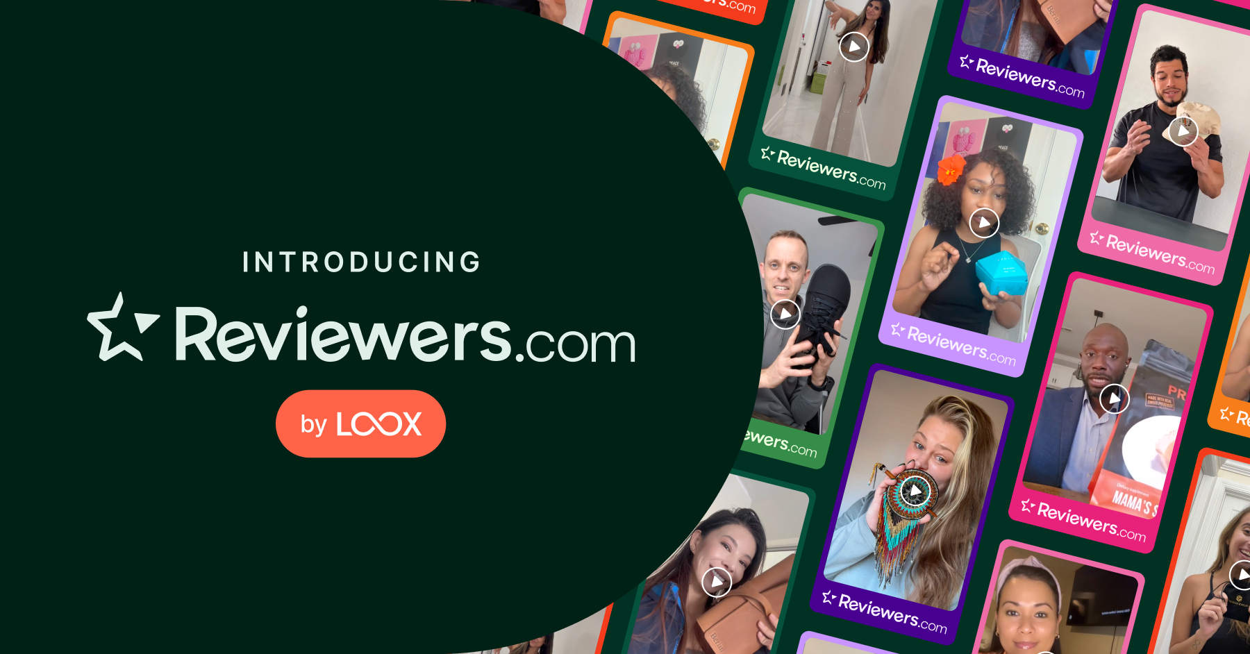
Cassidy Oberfeld
September 3, 2024
3
min read

Looking to boost your store conversions? You've come to the right place.
This guide will dive into the principles of conversion-centered design and how to apply them to your eCommerce store to maximize your sales. Think of it as your checklist for building a high-converting eCommerce store.
According to the co-founder of the landing-page builder solution Unbounce, Olí Gardner, there are seven principles of conversion-centered design:
Every fold in your store should focus on leading users to one desired outcome.
When someone lands on your store homepage, ask yourself, “What is the one thing you want them to do?”
Whether your answer is: go to my product catalog, book a call, or sign up for my newsletter, make all elements of your design work towards that goal.

Garuka Bars’ goal is to drive visitors to purchase. So, they added “Shop Now” and “Get yours” CTAs on their homepage to appeal to different types of customers while driving towards the same intent - purchasing.
How you organize information on your store impacts conversion rates.
Start by identifying the key elements—like product details, images, and reviews—that guide visitors to take action, such as clicking “Add to Cart.” Balance the content in a way that’s both visually appealing and also directing visitors to what to do next.

On Matchakin’s product page, the product name, ratings and reviews, and “Add to Cart” button are strategically placed to guide visitors smoothly from trust-building elements to purchase. The gallery of product images enhances visual appeal, while detailed product information is placed below the fold to keep the layout clean and focused.
Consistency builds trust and keeps your brand top-of-mind
Your brand identity—colors, fonts, and tone—should be uniform across all touchpoints to create brand recognition and build credibility with your customers.
With Loox’s upgraded Product Reviews Widget editor, you can easily customize the colors, font, and style of your Product Reviews Widget to align with your brand identity. Loox offers countless customization options for your reviews widgets, emails, and more so businesses can provide shoppers with a consistent experience across all interactions with your customers.

Wiley Body has a strong brand identity that is conveyed across the entire customer journey, from the homepage to product pages to review request emails.
Visuals should highlight the benefits of your products at a glance.

Climbonequipment, a climbing equipment store, uses the slogan “In Pursuit of Peaks” paired with a striking hero image of a climber reaching a mountain summit. This visual storytelling immediately conveys the brand’s promise, showing visitors the tangible benefits of their products.
Your CTAs should naturally draw attention and guide customers to action.
Effective CTAs should stand out with eye-catching colors and clear language that directs users to take the next step, like “Shop Now” or “Add to Cart.” Make sure it's clear what happens when they click.

Terra & Self highlights their CTA with a bright blue that contrasts their orange brand color, making it impossible to miss.
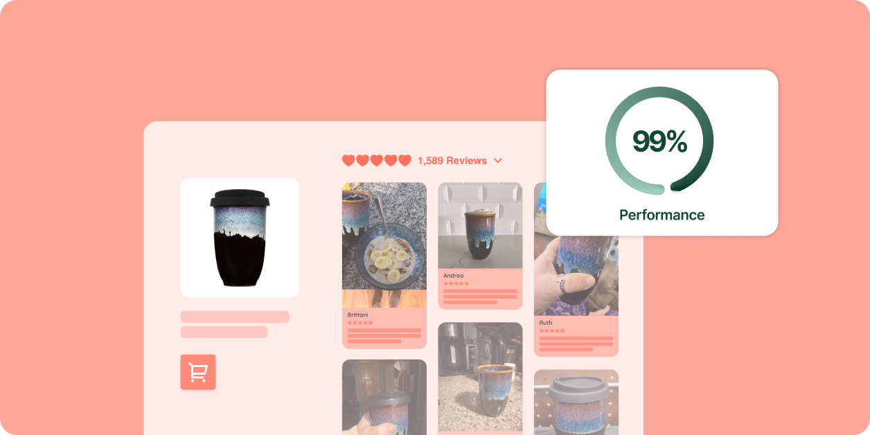
Leverage social proof to build trust and encourage conversions.
Customer reviews are a powerful tool for increasing trust and driving conversions, with the majority of shoppers considering them before making a purchase. Loox’s automated review forms help you gather visual UGC, making it easy to showcase happy customers across your store.

Balance Coffee effectively uses social proof by highlighting overall ratings and prominently featuring reviews on its homepage and product pages.
Make the conversion process as smooth as possible.
Optimizing your site for mobile is crucial, as many shoppers browse on their phones. Ensure your site works seamlessly across devices to avoid losing potential customers.
Simplifying forms can also reduce friction. Multi-step forms, like the Loox review form, break the process into manageable steps, improving the user experience and boosting conversion rates.
Implementing conversion-centered design principles can help you optimize your Shopify store’s performance. Remember to:
By applying these principles, you’ll create a more effective, conversion-focused e-commerce experience that drives results.