Steve Smith
July 3, 2019
min read

Customer satisfaction is king in eCommerce. Consider the following example: If your customers are not satisfied, you’ll have a hard time keeping them around. No retention means that your customer base will slowly shrink. The shrinking will accelerate because of the negative word of mouth of the bad experience you provided. Now you have a shrinking customer base, horrible reputation, and plummeting profits, how long do you think you’ll remain in business?
That grim story above isn’t meant to scare you. It’s meant to show you the real impact of customer satisfaction on your business. In fact, Walker Consulting predicts that by 2020, the key differentiator between businesses will not be product price or quality of the product. The key differentiator will be customer experience. How confident are you in the current level of satisfaction provide your customers? Are they having the best possible shopping experience with you?
If you’re not sure about that, I’ve got you covered. The following article will breakdown the two types of data you need to make your customer experience the best it could be. Let’s dive in!
Quantitative data can be defined as “the cold, hard numbers”. It’s the “hard” information that is not up for interpretation and just is what it is. In eCommerce, quantitative metrics include click-through rates, time on sites, visitor counts, and really any marketing measure that can be represented numerically. Quantitative data is often collected through heatmaps, surveys, KPI analytics, and A/B tests. For the number crunchers, quantitative data is like being a kid in a candy shop. However, quantitative data does not paint the full picture of what’s really going on in your store. To gather data that will dramatically improve your business, you also need qualitative measurement data.
Qualitative measurement data leaves more room for interpretation and can be analyzed subjectively. Instead of just taking what the numbers say as the end-all-be-all, qualitative measurement data questions. Does it ask why are the traffic numbers so low? What problems could users be having on the site? Why are the cart abandonment rates so high? Some of the best ways to get the answers to these questions are to collect qualitative measurement data in the form of customer interviews, focus groups, and other observational methods.

HotJar’s Incoming feedback tool makes it simple to collect your users’ sentiments about your website or app. Studies show that most customers will have a negative experience on your website and not tell you about it.

Why? Many eCommerce store owners don’t have an easy, no-brainer feedback tool available for their users.
The more you collect great feedback, the more you can improve your user experience. The more you can improve your user experience, the more profitable your business will be!
Do you know how your customers feel after purchasing or are you just guessing that they had a positive experience? Having an After Purchase Questionnaire like the one shown below will give you insights that you can use to better the cart and checkout process.

Word of mouth referrals are some of the best in eCommerce. When customers have had such a great experience with you that they’re willing to shout it from the top of the mountains is the holy grail of eCommerce. How do you know if your customers are willing to tell their friends about your store? You use a Net Promoter Score. Not only does this index measure your customers’ overall satisfaction with your store, but it also measures the willingness of the customers to tell others as well as their overall loyalty to your brand.

Here’s what a Net Promoter Score would look like.
The question before would be something like “How likely are you to recommend us to a friend or colleague?” Customers will then rank you out of 10.
Use this image as a guide for when you collect the answers to find out who are the Detractors (low loyalty/very unlikely to recommend you), Passives (average loyalty/more or less likely to recommend you), and the Promoters (high loyalty/very likely to recommend you).
Email is still one of the best ways to promote a new blog piece, sell a product, and also to collect powerful feedback. Many eCommerce store owners get shiny object syndrome where they get distracted by the hottest tools to do XYZ and often neglect the time-tested, proven paths like email. Below is an example of an email used to get the users to give their feedback on the new look of the Withings Scale. You can see the clever header copy playing on the popular words of weight loss “What do you think of our new body?”, simple copy in the actual email, and then letting the users know how long the survey will take to complete.

Let’s face it, we have all made a decision based on the experience of others. “If it’s good enough for them, then it must be good enough for me”
As a Shopify store owner, it’s important you have an element of social proof if you want to increase your conversion rate. There are a few different ways you can do this, they are easy and simple to implement:
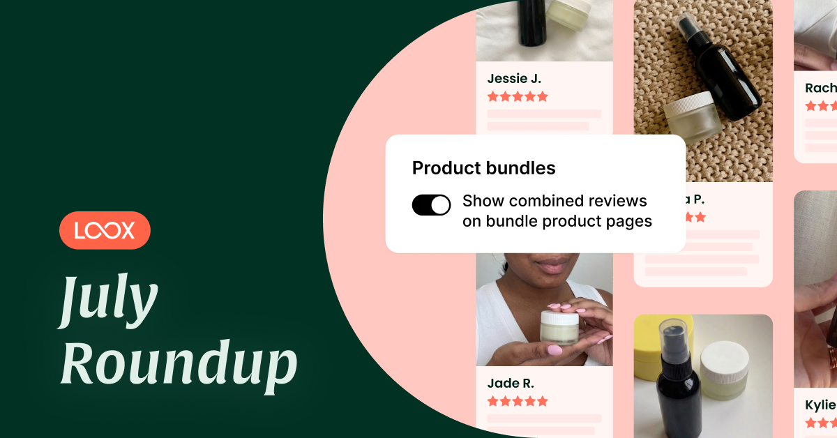
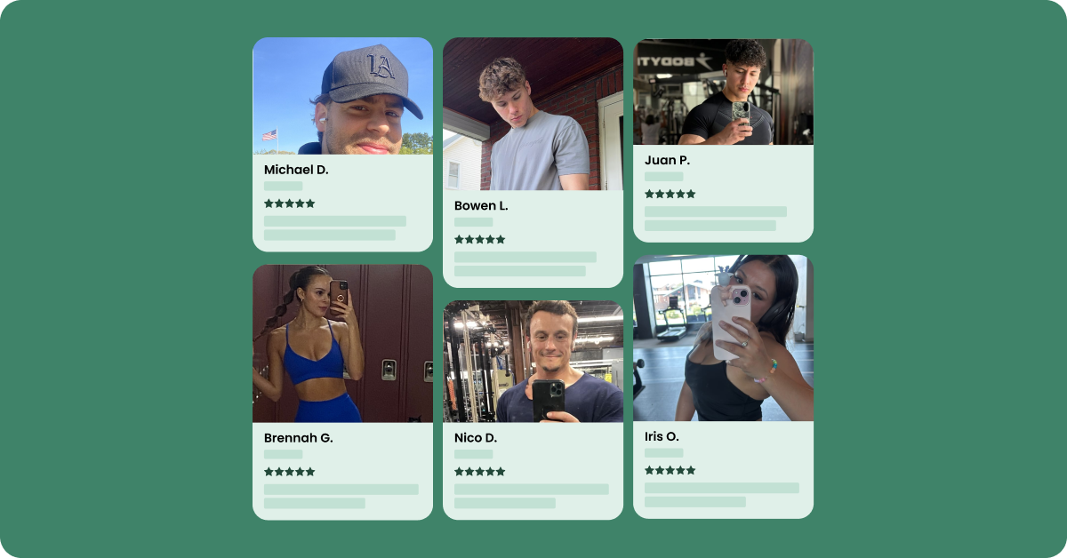
Installing an app like Loox (Shopify reviews app) allows you to display picture customer reviews for your product. This is even more powerful than just written add reviews to shopify as it shows the customer with the product.
Images are a lot easier to process than text, plus they add an element of authenticity in a world where online customers are becoming more and more skeptical of written “faked” reviews.

Heatmap tools like HotJar help you to visually see your data to better understand customer behavior. They give you clear insights as to which piece of content is the highest converting, where on your site your customers are spending the most time, and a plethora of other key points.
Do you know which pages your users are clicking on the most? If not, this is where clickmaps come in. As another visual data tool, clickmaps help you in identifying the areas where users are clicking on the most. Hot zones (most clicks) are usually represented by the red color and cold zones (least amount of clicks) are represented by the blue and green colors.

Scroll maps let you know where your users are scrolling the most. They tell you about their scroll patterns and where they hover the most on your site. This is another nice way to see how users generally interact with your site so you can make it better and easier to use.


Some of the best heatmap tools include HotJar, Lucy Orange, Heatmap, SessionCam, Decibel Insight, and DugWood ClickHeat. The picture above gives some quick reasons as to why these tools are some of the best on the market.
The 5-second test is a user experience testing technique that measures how well a design quickly communicates a message. This type of test is an indispensable part of your user experience optimization because studies show that visitors take only a few seconds to decide if they want to stay on your site or leave. The faster you’re able to communicate that this is a site they want to stay on, the better. One of the best tools to carry out these test is UsabilityHub.

Bounce Rate refers to the percentage of people who leave your site immediately after arriving. This can happen if you’re not using the right keywords in your campaigns, if your website is confusing or takes a long time to load, and if your site is not mobile-responsive, amongst a host of other reasons.
To discover your bounce rate, divide the number of people who leave your site by the total number of visitors.

Head to the Behaviour Menu in your Google Analytics. Then under Behaviour Menu -> Site Content -> Landing Pages. This is where you can include Bounce Rate as a measure and then find out the bounce rate from all your pages as shown above.

This report will also show you the most visited pages with high bounce rate. With this new information, you can work on those pages to keep users on them and eventually convert them into customers.
Exit Pages show a user’s outflow from your website. In other words, it shows you where the user exits after they start their first session. Knowing this is important because pages with high exit rates point to one or more user experience faults.
Keep in mind, there are a variety of reasons why users exit and some of those reasons may not be related to your site’s UX. It’s still a good metric to know and keep track of to see if there are any patterns in the exit pages. To Find Exit Pages in Google Analytics, head to Content > Site Content > Exit Pages.
The image below lists the pages where the most exits happen in chronological order. The percentages on the right-hand side also show those pages’ exit rates compared to the site average.

Devices is a section in Google Analytics that let you know what devices your users and customers are using on your site. This is important because it helps you determine which browsers and mobile devices you can optimize for and thus improve user experience. To check this out, head to the Audience –> Mobile –> Devices.
The image below shows which devices most users are using from most popular to least popular. Also worthy to note, the image below highlights which devices have high bounce rates and low conversion rates.

Browser and Operating System (OS) tells you which browsers and operating system is most used or least used amongst your users. It’s important to know this because browsers present data differently from one another. For example, users are going to have different experiences on Safari than on Google Chrome. Information will be displayed differently, pages will load differently, etc. Google Analytics can tell you which browsers have high bounce rates and low conversion rates.
To find this, head to Audience–> Technology–> Browser & OS. With this information, you can now run tests and optimize to improve the user experience on a particular browser. The image below shows that even though Safari is the second most used browser, it has one of the highest bounce rates.

Page speed (or, load time) refers to the total amount of time it takes the content on a specific URL to load. The slower URLs take to load on your site, the more likely you’ll lose users. We’re living in a time where attention spans are shorter than ever and that means you have less time to make a good impression on your users. To see average load time (in seconds) on Google Analytics, head to Behaviour–> Site Speed–> Page Timings.
As the image shows below, you can see the fastest loading pages and how they compare to the site average.

This metric helps you understand how long it takes someone to buy from your website and whether that behavior is different across different segments of your website customers.
This can help you with remarketing, upsells, and other conversion improving marketing techniques. In Google Analytics, Time Lag can be found under Conversion–> Multi-Channel Funnels–> Time Lag. As the image below shows, the time it takes someone to buy from the site takes 12-30 days.

This metric measures the depth of each visit to your site. In other words, It helps you to see how many pages the average visitor to your site views before completing a purchase. Knowing this helps you figure out where customers are falling off in the funnel.
To find your path length, head over to Conversions –> Multi-Channel Funnels–> Path Length.

In the image above, you can see Path Length and the conversions that occurred (in number of interactions).
Providing the best possible user experience should always be top of mind in eCommerce. Other than having a great product and a solid business strategy in place, you’ve always got to be finding ways to make things easier, smoother, and more enjoyable for your customers.
The best data is data that makes sense.
To help you in improving your customer satisfaction using intuitive insights, you can check out our app, Conversific.

As an eCommerce store owner, you already have a lot on your plate. Let us do the heavy lifting and give you clear insights that actually move the needle!
My best advice to you is collect quantitative and qualitative data, stay on top of the metrics mentioned in this article, work to improve bounce rates on various devices and operating systems, and remember to make sure customers have a feedback channel.
Hope you enjoyed the article.